
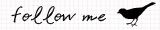
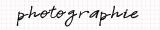


I recently had a new logo made for my portrait photography. I haven't really put it out there yet. So I thought I'd get some opinions from you, my dear readers.
Here it is:
May 26, 2009
Just curious...
![]()
Subscribe to:
Post Comments (Atom)


8 comments:
I like this. Is there anything you don't like about it that's keeping you from using it? And if so can you have it changed a little so you're more excited about using it?
it doesn't say portrait photography to me, if I didn't know that I would assumed nature photography or general photography but I like the black against the blue and it's very elegant
I dig it! Colors are great and I like the font too. The little bird adds a bit of whimsy without being cheesy.
I like the shape, colors, font, everything - but I do tend to wonder about lissa's comment, that the bird makes it seem more like nature photography. What if you kept the idea and used a different silhouette? I like the idea a lot and I would probably use it anyway because it is so pretty.
I love it. I think it's really cute.
I love it everything about it.
Hi Rachel, i like the colors and the font styles! but i think i agree with lissa:) the bird gives me the impression of nature photography.
it's gorgeous!
my photography is still so green and amateur, but if i ever get to have a photography business, the name will be similar—Jorjah-B Photography. but the logo will be what i have on my Jorjah-B blog.
your blog and your photography are beautiful.
so glad i happened upon it.
Post a Comment